NAME, a free knitting pattern from Knitty.com. Free knitting pattern for a DETAILS HERE.
INTRODUCTION
How to create a successful Magic Knot Ball
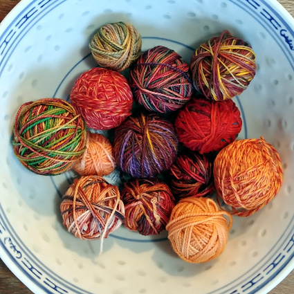 by Danny Ouellette
Most knitters have a collection of small leftover balls of yarn. We don't want to throw them away, but what do we do with them?
A Magic Knot Ball is a great use of leftovers. Assembling lots of yarns into one larger ball isn't hard. Anyone can learn to tie the magic knots and make a ball. But how do you take a pile of random-color leftover yarns, all in the same gauge, and turn them into a brand-new gorgeous colorway? Read on.
If you'd like to see the results of a Magic Knot Ball in a project, take a look at my pattern, Knoop. Magic Knot Balls are perfect for smaller projects, like a cowl, shawl, scarf, or socks.
Color Theory
To start, you'll want a basic understanding of color theory and its terms. There are two articles on Knitty that will help you get up to speed:
Next, you'll need to assess the amount of different colors in each yarn, because that helps guide how you should use them. The easiest to use is a solid color, followed by semi-solid, tonal, and heathered yarns.
- Semi-solid yarns vary slightly in color value.
- Tonal yarns include a range of light to dark values of one color. They read as a medium value with some highlights and shadows.
- Heathered yarns are spun from a mixture of different colored fibers. At a distance they read as one color but up close you can see more individual colors. This gives the color complexity by optically blending instead of having a single hue
- Yarns with long color shifts like Noro, Kauni and Zauberball, should also be easy to use. Depending on the width of your project, color shifts could happen after several rows, so you can treat these yarns as semi-solid.
- The next easiest are hand-dyed yarns with a limited color or tonal palette. They typically use analogous colors with possibly some accents, and a small tonal range. These will provide a lot of color within their rounds but give an overall impression of one color at a distance. You could put them next to another yarn sharing any of its colors. For example, you could choose a contrast color in the yarn and pick it up in the next yarn rather than continuing with the main color.
- One of the hardest types to work with is hand-dyed yarns with a large palette. These have wild colors from across the color wheel, light and dark values, or both. They call attention to themselves. You might want to limit them to a couple rounds of accent or possibly the bind off edge.
- Self-striping and patterned yarns can be the most difficult to work with. In a self-striping yarn, the colors can change so often that it might not make a single round or row. If the colors of the stripes are close to each other, you could use the yarn as is. If there is a great contrast between the stripes, you might want to separate the yarn into stripe colors. You could make a mini Magic Knot Ball for each color and use those balls as a solid or semi-solid yarn.
- Patterned yarns are tricky. The patterning will be muddy. You might need to remove sections with more patterning and only use straightforward sections. If you use the yarn as is, limit it to a couple accent rows.
Prepare your stash
Sort your yarns into seven color piles by their dominant hue: red, orange, yellow, green, blue, purple and neutrals. Neutrals are white, black, greys, browns, tans and cream colors.
Now take a look. Do you have a lot of one color or a good mix of colors? Does it feel like you'll get a ball with with smooth transitions or a stripy mix? It’s good to have an idea of what you want the colors to do. Do you want them to subtly blend together, or do you want bold blocks of color? A bit of both?
Subtle blends are where the difference between the individual yarns is slight. The hue, value and saturation of adjacent yarns will be close. An example of this would be a set of analogous colors shifting between two or three hues and keeping similar values and saturations. Another example would be a tonal shift from a light to dark value with the hue and saturation remaining fairly similar. The red-orange version of Knoop is designed this way.
Bold blocks of color will produce a striped effect. The differences will be large and noticeable. Examples would be alternate light and dark values, complementary colors, or yarns of very different saturations. Another example of this is a stained glass effect where a single color of yarn separates stripes of color. The blue-green version of Knoop is designed using light and dark value stripes.
Color combination samples
Sample 1 - Tonal shift
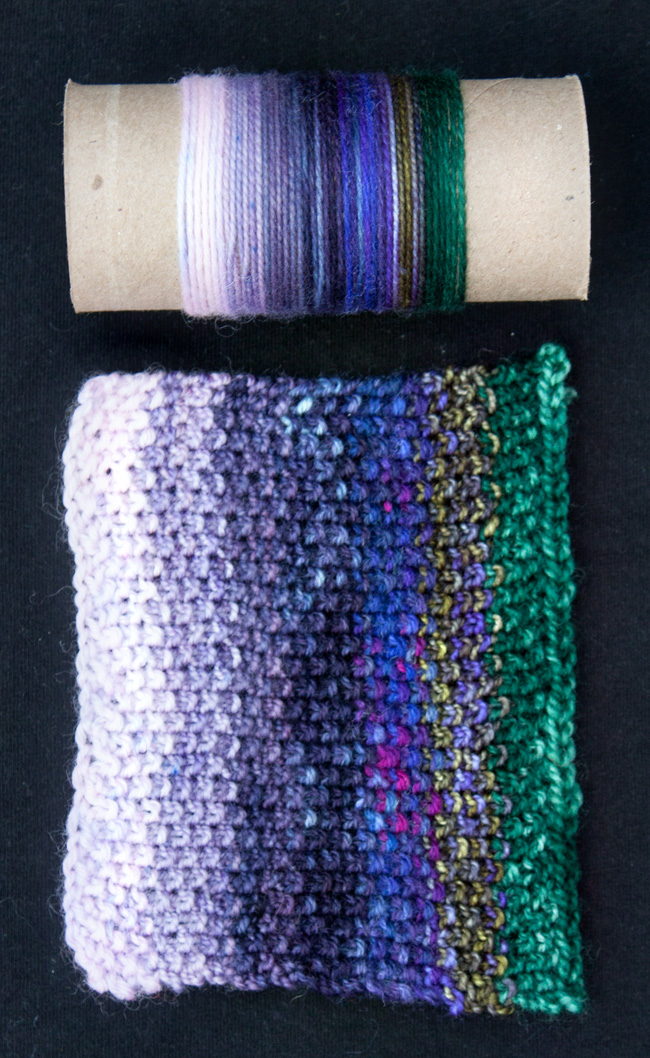
Sample 1 above uses seven yarns that show a tonal shift and end with a contrasting edge color.
The first four shift light to dark in reddish purples. The fifth expands the range by adding more blue-purple and red-purple shades. The sixth is blue-purple and yellow-green, reading as green. The seventh is a dark green contrast edging.
I'm pleased with how well the colors flow through this swatch and how the green provides a nice contrast at the edge.
Samples 2 & 3 - Analogous colors
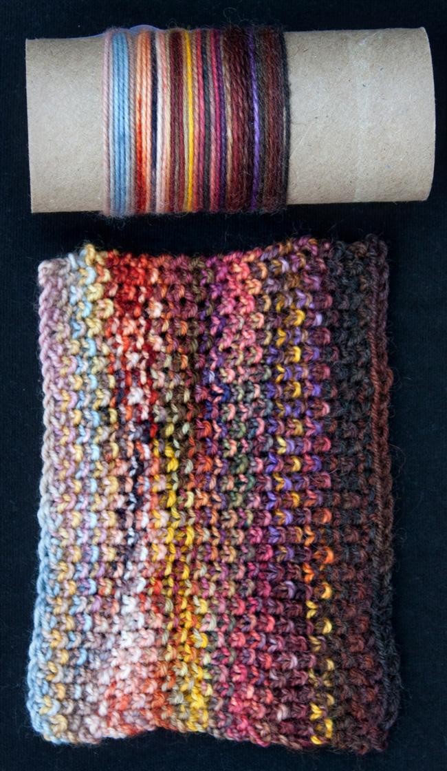
Sample 2 above uses six yarns in red to orange hues that shift tonally from light to dark.
The first is muted colors of violet-rose, dusty blue and dusty yellow. The second through fourth are reds and oranges becoming darker in value. The fifth is dark red-orange with blue-purple, gold and dark browns. The sixth is reddish brown, dark browns and black.
The color and tonal fade work well and I like the pops of yellows throughout.
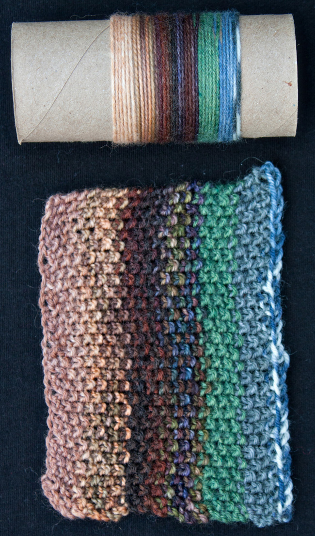
Sample 3 above uses six colors of analogous neutral tans and browns, shifting light to dark, with a contrast edging.
The first four are neutral tans and browns that get darker in value. The fifth and sixth were chosen as contrast to go with the blue highlight of the fourth yarn.
This sample has several problems. The wrapped sample on the tube looks good, but after seeing the swatch I would swap the third and fourth yarns. I don’t like the fifth color and would remove it. The sixth color is a better match to the highlight of the fourth yarn. The sixth yarn also needs a fix. It is a self-patterning yarn. The pattern change on the edging is distracting and should have been removed.
Samples 4 & 5 - Complementary colors
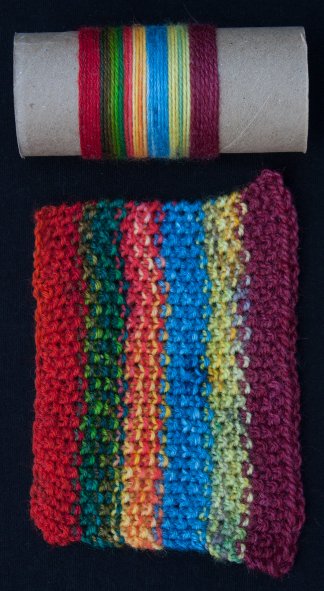
Sample 4 above uses six colors: red, green, orange, blue, yellow and purple, in saturated colors with strong contrasts in hue and value.
I find this combination too intense, but know some people like it and can wear it. I would change the purple. It is a solid color with too much red in it. A semi-solid with a balanced red-blue purple will work better.
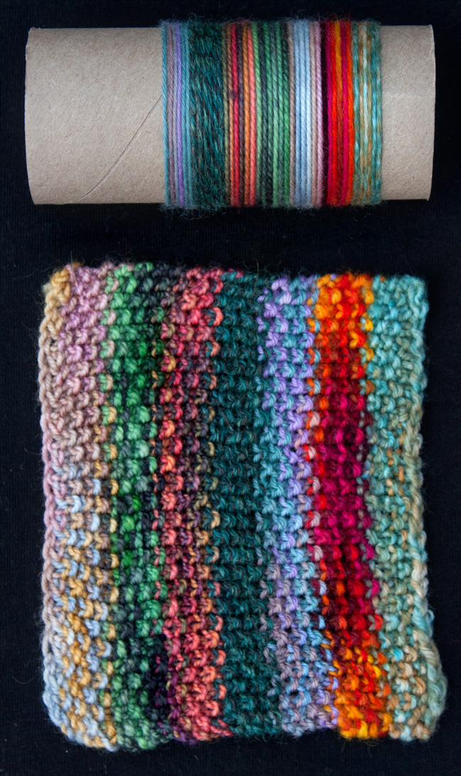
Sample 5 above uses seven colors, with mainly red and green hues. The colors are less saturated and contrasting between hues and values.
I swapped yarns two and four when making the swatch. This kept the value contrast more even in the swatch. I used some split complements, which are colors on either side of the true complementary color. This gives a more subtle contrast between colors. The swatch still stripes but is more sedate.
There are two things I would change. The dusty rose of the first yarn reads more purple then red. It blends too much with the second yarn and should have been redder. The sixth yarn should be a less saturated red-orange to blend better.
Sample 6 - Self-striping and patterned yarns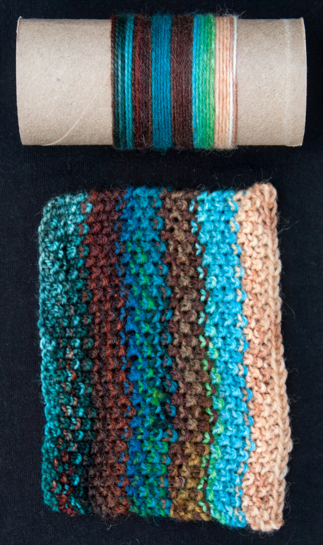
Sample 6 above uses six colors, three sets of blue-greens and neutrals. The sets shift from dark to light values.
The two middle colors come from a self-striping yarn that was split into three mini balls. The balls were a mix of blues/purples/greens, neutrals and yellows. I used the blue mix and neutrals, leaving the yellows for other projects.
Sample 7 - Stained glass effect
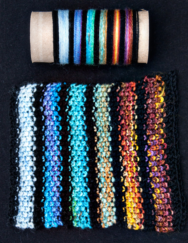
Sample 7 above uses black as the separator and six colors of light to medium values. The colors shift from blue to blue-green with gold highlights, to red-orange and finally purple and brown with gold highlights.
To achieve this efffect, colors are separated with rows of a single color, typically black. Any neutral could be used as long as it strongly contrasts with chosen colors. You can also use a very dark or light hue of another color in your collected yarns. This technique allows colors that wouldn’t work side by side to stand alone and not clash as much.
Select your initial colors
Now that you have some ideas, start by picking a color that speaks to you. Then pick others that go with it or contrast. Place them side by side and rearrange them till you like the selection. For example, a typical cowl might need eight to twelve colors, depending on yarn amounts.
Make swatches to test your selections
Color wrappings (as I've done in the photos above) are a quick way to see how your yarns will interact. An empty toilet paper roll works well, as does a piece of cardboard or an index card folded into thirds. I suggest not cutting yarns on your wrapping so you can save them for the project.
Have some clear tape ready to hold down the ends. Hold the yarn end at the back of roll. Wrap it five or six times. Tap the wraps lightly with a finger to keep them snug. Lightly place a piece of tape across both ends of the yarn to secure it to the mount. The tape should be loose enough to remove the yarn if the color doesn’t work. When all the colors have been wrapped you can assess how well the sequence works. I also suggest you make a small swatch to get a better sense of how they interact. Some color combinations that look good when wrapped look quite different when knit up.
Swatch Pattern
Using US #2.5/3 mm needles and your first color, cast on 29 stitches.
Work 6 rows of Seed Stitch
Row 1: (K1, p1) 14 times, k1
Repeat Row 1 five more times
Do not cut the yarn.
Introduce the next color and work 6 rows of seed stitch in that color.
Repeat until all colors have been used. Loosely bind off using the last color.
If making a sample for a stained glass effect, work four rows of seed stitch in the separator color between your other colors, carrying it up the side of your work.
Now that your samples are made, have a good look at them and decide if you want to make any changes. Re-arrange or replace colors as needed. Once you are happy with your color selections, you can proceed with winding them into your Magic Knot Ball.
Looking for a project to make with your new Magic Knot Ball? My Knoop cowl was designed for just this purpose.
ABOUT THE AUTHOR
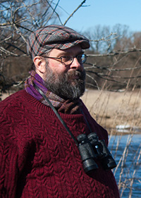 Danny Ouellette is a long-time knitter, spinner, dyer and knitwear designer. In 2014, he completed the Ontario Handweavers and Spinners spinning certificate program. He has presented lectures and workshops to several local spinning / weaving and knitting guilds in Southern Ontario and at the Ontario Handspinning Seminar.
He currently lives in Waterloo with his partner and more fiber-related stash and equipment then they know what to do with.
You can find out more about him and his fiber habit online on his website and on Ravelry.
Text © 2019 Danny Ouellette, images © 2019 Van Waffle, except yarn bowl © 2019 Danny Ouellette.