|
|
 |
 |
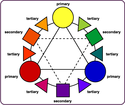
 Color Theory No matter which category you fall in, it’s never a bad idea to sit down with a color wheel or some color charts and play for a while. I remember in color theory class in college, we had massive color pages where we had to mix paints and make teeny tiny squares. Gradients from light to dark, mixing the primaries, shading and lightening the primaries, shading and lightening the mixes...and so on. It was tedious at the time but it does leave you with the feeling that you really get what mixing is about. Blending and making colors goes way beyond the primary school version of yellow and red make orange. This is not? necessarily about making red and yellow look orange but it does help to know a little more about color and how color works together when choosing fiber colors for a sweater. First find yourself a color wheel.
The Lingo Primary colors are the colors that we all grew up with. Red, yellow and blue. The basic colors that we use to mix and base other colors on.
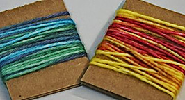
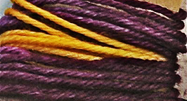
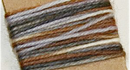
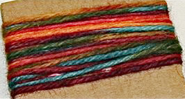
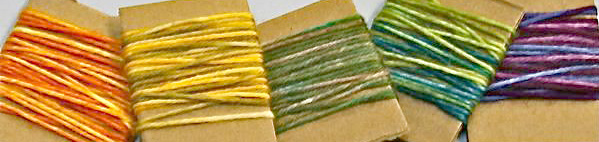
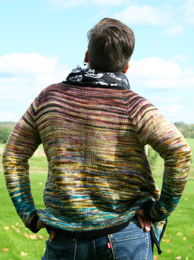
Then we have some yarns/fibers that use the color wheel in a unique way . We can use them, but need to know how. Let’s take a look at some handpaints and how to put them together. Blending for your sweater:Whether it’s handpainted commercial yarn or handspun these can be combined to make enough for a sweater. Even if the colors seem random and wild, it can be done. In fact, random and wild makes it better sometimes. Of course, you can choose with just your intuition, but if you want to follow some color rules and make an overall blended sweater then this is a simple guideline. Let’s start with handspun. Or rather, lets just start with the fibers to make your handspun. I like to combine fibers that are similar. It’s my own little quirk but I have a reason. Merino behaves much differently from Romney. This wouldn’t necessarily stop me from putting them together, but it might make me try to find an alternative for one or the other. The Less is More sweater used all medium grade wools. For the example of picking handpainted top here, I’ve chosen medium grade wools. If you have the space, toss out a bunch of wools that you like. If you really have the space, toss out ALL your fibers have a look. Pick two to four fibers that you really want in your sweater. Don’t fall in love yet, you might not get to keep them all. Line them up. Squint. See how they will go together? Don’t see it blending well? Braid them (it bunches the colors and will help simulate what it’s potential is as a handspun) and then see if you can pick out similar colors. Does A flow to B and then B flow to C and C flow to D? [Photos : lim article fiber no circles AND lim article fiber] You can repeat this exercise, matching up your stash until you’ve come up with a group that seems to go together. This is meant to blend colors and use up a bunch of fiber stash. Color A and color D or E will likely not match up or look horrible if you place them side by side. But with 2-3 colors in between to blend them, somehow it’s perfect. This game is clearly meant if you have a stash. If you buy only per project then you may want to go to do this exercise at a fiber shop or fiber show. The process with commercial or handspun yarn is the same. I still like to work with similar fibers here. Though, more important than fibers is the weight of the yarn. You really want to keep themabout the same gauge. Less is More [link me!], for a a DK weight yarn, so we’ll pull out all of those and take a gander. Just as we did for the fibers, pull yourfavorites colorways then start matching , one color at a time until you have a line up of 4 yarns. A and D do not need to go together, they just need to match thie neighbors B and C . [Photo: lim article handpaint] It is helpful to make a cardboard swatch. Wrap a piece of cardboard with your yarns in the order you want to use them in your sweater, slightly overlapping where the colorways will change. You can see in the photo that the cardboard swatch really comes close to matching up to the final sweater. All in all this may take some time and you may need to acquire a new yarn or a new fiber to fill in a color space. The more you do this exercise, the better and quicker your eye will become at making the matches. This is a chance to step out of the box a little bit. Purple is not one of my favorite colors, but in a working set of handpainted yarns or fibers that has a touch of purple, it works for me When mixing it with other colors, the purple is less obvious to me and thereby making it more enjoyable and wearable. Play! Make your cardboard wrapped swatches. Sit on the floor with your yarn or fiber all around you. Have fun and make something wonderfully colorful. |
||||||||||||
| ABOUT THE AUTHOR |
|
|
|
Pattern & images © 2011 name name. Contact |