| This article is more about
tricks to help incorporate color into your knitting
than an article about color theory. The reason this
isn't about color theory is twofold: it has been
dealt with very ably by Suzyn Jackson over
here, and most of all because the term "Color
Theory" causes my brain to seize up. It's not
at all unusual for me to read a book on color theory
and then find myself unable to get dressed in the
morning because nothing matches. (Regardless of
what my husband says, I assure you, IT IS NOT FUNNY.)
I have studied color theory for years, knit sweaters,
and most of all worn outrageous color combinations,
and in many ways it is still a mystery. Conversation
with artists in other media has revealed that I
am not alone; when asked about color, a painter
friend of mine said "Beats me. I just play
around with paint." So this is more about ways
I deal with color, than any formal Theory.
There are various ways to put
more color into your knitting, and the easiest
and most obvious is to use a variegated yarn and
let the dyer do the work for you. This can work
well, particularly if you are not bothered by
the randomness of it, and the tendency for colors
to pool together or create odd streaks or other
patterns. (Unless of course you're using the new
patterned sock yarns, in which case it's not quite
random, but still out of your control.) One of
my own favorite methods of using variegated yarns
is to use one with a solid color to do slip-stitch
patterns or simple stranded color. If you try
this method, do NOT get your solid color to exactly
match any shade in the variegated; get it a little
lighter or a little darker, or another color entirely.
When they're the same shade, eventually you'll
put the solid and variegated next to each other
and the pattern you're knitting will disappear.
In Fair Isle knitting they call this being 'cut',
as in 'don't cut the pattern', when you use two
colors that are too close together in hue or intensity
and the pattern disappears. I call it Not Good.
Another easy way to do things
is to use two groups of colors, each group related
among themselves, but contrasting markedly from
the other group. Think in terms of background
and foreground, and then assign a color group
to each; blues for the background, and reds for
the foreground. Then you can throw in everything
you can possibly find in one of those colors and
know it's not going to be a complete disaster.
I am currently gearing up to knit "Persian
Poppies" by Kaffe Fassett. I am using greens
as the background -- any greens -- and pink/yellow/orange
for the flowers. This assures there will be enough
contrast to tell the background and foreground
apart, while letting me throw in a worrisome number
of colors without feeling completely insane. (Okay.
I still feel insane. But it's not the color choices
worrying me.) If you take a good look at Fair
Isle sweaters, you will find that a lot of them
work on this principle; two groups of colors,
or even one color and a contrasting group.
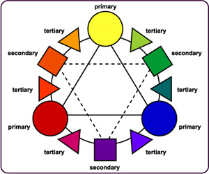
  When
picking your two groups of colors, or any other
time you're using color, you can dig out (or download)
a copy of the good old color wheel, and use it.
There are various methods; you can use adjoining
colors (red and orange) for a blended effect,
you can use opposite colors (red and green) for
an eye-catching and sometimes jarring effect,
you can pick three colors in a triangle (red,
yellow, blue) for something with enough contrast
to be interesting but enough 'match' to look good.
You can use it to find groups of colors, like
I did with my pink/yellow/orange flowers. Or you
can scribble a line over the darn thing and then
use every color that the line touches. It's possible
to get a little too pathological about it. (I
know. I do it all the time.) When
picking your two groups of colors, or any other
time you're using color, you can dig out (or download)
a copy of the good old color wheel, and use it.
There are various methods; you can use adjoining
colors (red and orange) for a blended effect,
you can use opposite colors (red and green) for
an eye-catching and sometimes jarring effect,
you can pick three colors in a triangle (red,
yellow, blue) for something with enough contrast
to be interesting but enough 'match' to look good.
You can use it to find groups of colors, like
I did with my pink/yellow/orange flowers. Or you
can scribble a line over the darn thing and then
use every color that the line touches. It's possible
to get a little too pathological about it. (I
know. I do it all the time.)
Another great way to get unusual
color groupings that you can be sure of 'working'
is to steal them. That's right, rip them off from
someone who DOES know color theory -- or guesses
at it better than you do. It doesn't have to be
from knitting, either. I used the colors Van Gogh
painted "Starry Night" with to knit
myself a jacket. While my jacket lacks the brilliance
of the original (darn
it), it does have some wild
color combinations I never would have thought of,
myself, and they work together.
(Oh, and that blue sky in
the painting? It's not blue. It's purple. Slap a
color card on a good print of the original and look
for yourself. It's a fine example of how putting
one color next to another can seriously screw with
how your brain sees it. And the black tree-thing
in the foreground isn't black. It's forest green.
Try putting a color card on top of your favorite
painting. You'll be shocked.) Other than paintings,
the sky's the limit. The Fasset Poppies sweater
I'm knitting was inspired by the flower beds at
my grocery store. I have tried repeatedly to capture
a Hawaiian sunset. (That project is likely going
to take hand-dyed yarn.) Like your grandma's quilt,
your in-law's dining room wallpaper, a favorite
cartoon character? Good. Steal the colors. If you
work it into a slick enough pattern, no one will
ever guess where you stole the colors from.
Another anomaly in color that
I've found over the years has to do with men and
color. Between 12 and 20 percent of European-heritage
men are red/green colorblind. Uh-huh. THIS MEANS
THE OTHER EIGHTY PERCENT ARE NOT. You wouldn't
know it to talk to most of them, though. I think
there's something cultural going on (at least
in middle-class, Midwestern, white-bread America)
with men learning colors. My husband serves in
the military and therefore has been tested for
every form of color-blindness known to man, AND
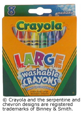
PASSED. He swears that there are only eight colors
in the world; the ones that come in children's
large-sized Crayola Crayon box. (Those colors
are red, yellow, orange, green, blue, purple,
brown, and black. Just so you know.) To test this,
I tried a scientific experiment (okay, I got out
my color cards and bugged him). The conversation
went something like this:
 |
The offending
color card. |
ME: "What color is
this?" (While holding up a color card.)
HIM: "Which one?"
ME: "In general."
HIM: "Purple." Pause.
"What's the card say?"
ME: "Blue-Violet."
HIM: "Right. Purple."
And I was expecting him to say
'blue'.
The only thing I can conclude
from this is, if you're knitting a sweater for someone
like this (I suppose there are women out there who
see color this way...statistically they have to
exist, right?), either negotiate every detail with
them, and let them pick out the color themselves,
or raid their wardrobe, find out what color they
wear the most of, and knit something with that.
"Honey, would you like a blue sweater?"
is going to end in disaster.
 |
| The only colors in the world. |
Please note: I realize there
are men out there who can carry on conversations
involving color. I love you.
Gift-giving is tricky in the
extreme, and throwing color into the mix complicates
it further. Pay attention to detail. Sometimes
you get lucky. My mother-in-law and I were visiting
a yarn store, she pulled a ball of yarn off a
shelf and said "Oh, what a pretty color!"
and I knit her next Christmas present with it.
(Mind you, it was a flattering color. I wouldn't
have done it if she were admiring neon green.)
She was delighted. I got off easy.
Observing what colors someone
wears can work; if they're an artiste and only
wear black, your decision is made. Most people
tend to stick to a family of colors (blues, greens,
neutrals) and if you make something in that neighborhood,
you're home free. Do NOT knit them something orange
to 'liven up their wardrobe' and expect it to
get worn. On the other hand, you can push the
envelope; when knitting for someone who wears
a lot of brown, try an extremely dark shade of
burgundy red. It's close enough they may feel
comfortable wearing it. (You have to know your
victim, though. Are they willing to wear slightly
different shades?)
The fallback is, of course,
blue. It's the favorite color of a lot of people,
matches nearly everything (if it's Navy or Indigo
or something like that), and is worn by a vast
majority of the planet, in the form of blue jeans
at the very least. I have knit more blue gifts
for people than you can imagine. Giving out knitted
gifts to everyone but a cousin you haven't seen
in fifteen years? Knit them a blue scarf. It'll
be fine.
Are you one of those people
who can never find the right color? You have a
color card (of course you have yarn color cards)
of a yarn that comes in sixty shades, and none
of them are the right one? You get DMC embroidery
floss to sew up a sweater and you're mad because
the match isn't close enough, even though it comes
in over four hundred colors? I wonder how many
of us there are, and how many have inevitably
begun dyeing their own yarns. (I'm just about
there, myself.) I don't know what to tell you,
but I do sympathize. Jamieson and Smith sells
155 colors, and Cascade 220 has 245 colors on
display over on their web site. (I for one am
trying to get a color card.)
I haven't said a lot about specific
techniques in this article, because really, you
can put color in anything you knit, even if you
simply choose a different color than the one in
the pattern photo. Stripes are easy, too. Don't
let know-how bog you down. (Although, you really
should try stranded color. It's easier than you
think.) And don't let the idea of the colors not
matching slow you down, either. Throw some color
in there! You'll be amazed at how happy you are
with the results.
RESOURCES: Here are places to
go for further information about color. But don't
think about it too hard; just knit.
BOOKS:
"Color" by Sally Melville.
Probably the most intelligent discussion on color
that is specific to knitting.
"The Art of Fair Isle Knitting"
by Ann Feitelson. She de-mystifies a lot of the
really complicated-looking Fair Isle patterns.
"Color" by Betty Edwards.
Color theory books are almost inevitably geared
toward painters, and this one is too, but not
as obnoxiously as most others.
WEB SITES:
www.crayola.com
It's fun. The amount of stuff they make other
than crayons is breathtaking. I recommend the
twist-up mechanical colored pencils for design
work.
http://www.toledo-bend.com/colorblind/Ishihara.html
The Ishihara color-blindness tests. (The ones
with the little dots.) See once and for all if
your significant other is color blind, or just
subscribes to the Crayon Theory of Color.
www.colormatters.com An interesting
site containing everything from basic color theory
to medical research on how the brain perceives
color.
PHOTO/PICTURE CREDITS:
Color wheel from http://www.artsconnected.org/toolkit/encyc_colorwheel.html
Starry Night from http://lilt.ilstu.edu/jhreid/frenchculture/19th_century_french_painting.htm
Crayons from www.crayola.com
All other photos by the author.
|

